A SaaS website is not simply a digital brochure. It is often the first sales conversation, the first product demonstration, and the first trust signal a potential customer receives. For higher conversions, every page must help visitors understand the product, believe the promise, and take the next step with confidence.
TLDR: A high-converting SaaS website clearly explains who the product is for, what problem it solves, and why it is worth trusting. The strongest sites combine precise messaging, credible proof, simple navigation, fast performance, and focused calls to action. Conversion gains usually come from reducing uncertainty, improving relevance, and making the buying or trial process easier.
Start With a Clear Value Proposition
Your value proposition is the foundation of your SaaS website. Visitors should understand within a few seconds what your software does, who it helps, and what measurable result it supports. If your homepage headline is vague, clever, or too broad, users may leave before they explore the product.
A strong SaaS value proposition usually includes three elements:
- The target customer: Identify whether the product is for sales teams, finance leaders, developers, agencies, healthcare teams, or another specific audience.
- The core problem: State the pain point clearly, such as reducing manual reporting, improving onboarding, automating billing, or managing compliance.
- The business outcome: Connect the product to results, such as faster workflows, lower costs, improved visibility, or reduced risk.
For example, a weak headline might say, “Work smarter with modern software.” A stronger version would say, “Automate client reporting for accounting teams in half the time.” The second version is more specific, more credible, and easier to evaluate.
Design for Trust Before Persuasion
SaaS buyers are cautious because adopting software often involves time, budget, data, and organizational change. Before they are persuaded, they must feel safe. Your website should address that concern through professional design, transparent information, and credible evidence.
Trust signals can include:
- Customer logos from recognizable companies or relevant industry peers.
- Case studies showing measurable outcomes rather than generic praise.
- Security and compliance references, such as SOC 2, GDPR, HIPAA, ISO standards, or role-based access controls where applicable.
- Testimonials that include names, roles, companies, and specific results.
- Transparent contact information, including a business email, support details, or office location when relevant.
A trustworthy website does not overstate results or rely on exaggerated claims. Phrases such as “revolutionary,” “guaranteed success,” or “the only solution you will ever need” can sound promotional rather than reliable. Serious buyers are more likely to respond to evidence, clarity, and restraint.
Make Navigation Simple and Intentional
Navigation should guide people toward the information they need, not display every page your company has created. Most SaaS websites benefit from a clean structure with links such as Product, Solutions, Pricing, Resources, Customers, and Contact or Book a Demo.
Keep the top navigation focused. Too many choices can create hesitation, especially for visitors who are still trying to understand the product. If your SaaS platform serves multiple industries or use cases, use organized dropdown menus, but avoid overwhelming users with long lists and unclear labels.
Best practice: Use language your buyers use. A navigation item labeled “Platform Capabilities” may sound polished, but “Features” or “How It Works” may be easier to understand. Clarity usually converts better than internal terminology.
Create Dedicated Pages for Key Use Cases
Many SaaS companies lose conversions because they try to speak to everyone on one page. Different buyers care about different outcomes. A chief financial officer may focus on cost control and risk. A team manager may care about productivity and adoption. A technical buyer may evaluate integrations, APIs, and data security.
Dedicated landing pages allow you to match messaging to user intent. These pages can be created around:
- Industries: SaaS for healthcare, education, real estate, finance, or manufacturing.
- Roles: Solutions for operations teams, HR leaders, marketers, developers, or executives.
- Use cases: Automating workflows, improving reporting, managing subscriptions, reducing churn, or centralizing customer data.
- Competitor alternatives: Comparison pages that explain differences honestly and professionally.
Each page should include a focused headline, relevant pain points, specific product capabilities, proof from similar customers, and a clear call to action. Relevance is one of the most reliable drivers of conversion.
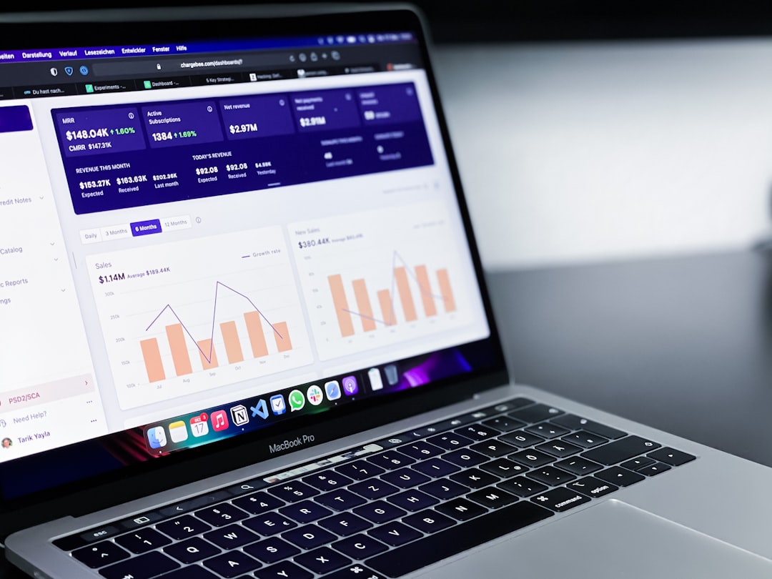
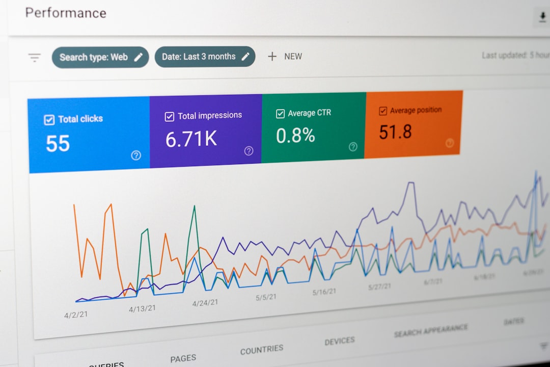
Use Product Screenshots and Visual Explanations
SaaS buyers want to see what they are evaluating. Abstract illustrations may support branding, but they should not replace real product visuals. Screenshots, short interface previews, workflow diagrams, and interactive demos help visitors understand how the software works.
When using product visuals, make sure they are clean, readable, and connected to a benefit. Do not show a dashboard merely because it looks impressive. Explain what the user can accomplish with it. For example, instead of saying “Advanced dashboard,” say “Monitor revenue, churn, and expansion trends in one executive view.”
Visual hierarchy also matters. Important screenshots should be placed near relevant copy, not hidden in a carousel that visitors may ignore. If the product is complex, consider using step-by-step visuals to show how a user moves from problem to solution.
Build Calls to Action Around Buyer Readiness
Not every visitor is ready to start a trial or book a demo. Some are comparing vendors, some are gathering information, and some are validating whether your product fits their requirements. A high-converting SaaS website offers calls to action that match different levels of intent.
Common SaaS calls to action include:
- Start free trial: Best for products with simple onboarding and low friction.
- Book a demo: Best for complex, enterprise, or high-value products.
- View pricing: Useful for buyers who need budget clarity before engaging.
- Watch product tour: Helpful for visitors who want to understand the software before speaking to sales.
- Download guide or checklist: Effective for earlier-stage visitors, especially in longer buying cycles.
Your primary call to action should be visually prominent and repeated throughout the page at natural decision points. However, avoid placing too many competing CTAs in the same section. A page that asks visitors to start a trial, book a demo, download a report, subscribe to updates, and contact sales all at once can reduce action because it creates confusion.
Make Pricing Clear Whenever Possible
Pricing transparency is a major conversion factor. Many SaaS buyers use pricing pages to determine whether a product is worth further evaluation. If pricing is hidden without explanation, visitors may assume the product is too expensive, too complex, or not intended for them.
If you can publish pricing, keep it clear. Show plan names, monthly or annual costs, included features, usage limits, and the intended customer for each plan. If your pricing depends on seats, usage, modules, or enterprise requirements, explain that clearly and invite visitors to request a tailored quote.
A strong pricing page often includes:
- A recommended plan for the most common customer segment.
- Feature comparison tables that are detailed but not excessive.
- Frequently asked questions about billing, cancellation, onboarding, support, and upgrades.
- Security and procurement details for larger organizations.
The goal is not always to make pricing look cheap. The goal is to make value understandable and remove unnecessary uncertainty.
Reduce Friction in Forms and Sign-Up Flows
Forms are often a major conversion bottleneck. Every additional field creates effort, and every unclear request creates hesitation. Ask only for the information you genuinely need at that stage.
For a demo request, name, business email, company, and role may be enough. For a free trial, requiring a phone number, company size, industry, budget, and detailed comments may reduce sign-ups unless there is a strong reason. If your sales team needs qualification data, consider collecting it progressively after the first conversion.
Improve forms by:
- Using short labels and clear error messages.
- Explaining why sensitive information is requested.
- Allowing single sign-on when appropriate.
- Confirming what happens after submission.
- Keeping mobile form fields easy to complete.
A simple message such as “After you submit this form, our team will contact you within one business day to schedule a 30-minute demo” can increase confidence because it sets expectations.
Optimize Speed, Accessibility, and Mobile Experience
Conversion is not only about copy and design. Technical performance directly affects trust and usability. Slow pages cause abandonment, especially when visitors are comparing several vendors. Large scripts, uncompressed images, excessive animations, and poorly implemented tracking tools can all damage performance.
Your SaaS website should load quickly, work reliably on mobile devices, and meet basic accessibility standards. Use readable font sizes, strong color contrast, descriptive alt text for images, keyboard-friendly navigation, and clear focus states for interactive elements. Accessibility is not only a compliance concern; it improves the experience for all users.
Mobile visitors may not always convert immediately, especially for B2B SaaS, but they frequently research options on mobile before returning on desktop. A poor mobile experience can eliminate your product from consideration before the buying process begins.
Use Social Proof With Specificity
Social proof works best when it is specific. A testimonial that says “Great product and excellent support” is better than nothing, but it is not as persuasive as one that says “We reduced manual onboarding tasks by 42% in the first quarter and gave our customer success team six hours back each week.”
Case studies should follow a clear structure: the customer’s challenge, why they selected your product, how implementation worked, and what results they achieved. Include metrics where possible, but avoid unsupported claims. If exact numbers cannot be shared, use credible qualitative outcomes and practical details.
Place social proof near moments of decision. For example, include customer quotes near CTAs, security badges near demo forms, and relevant case studies on industry-specific pages. Proof is more effective when it directly supports the action you are asking the visitor to take.
Measure, Test, and Improve Continuously
A SaaS website should be treated as a revenue asset that improves over time. Use analytics to understand where visitors come from, which pages influence conversion, where users drop off, and which CTAs receive engagement. Combine quantitative data with qualitative insights from sales calls, customer interviews, form feedback, and session recordings.
Useful tests may include:
- Different homepage headlines focused on outcomes versus features.
- Shorter demo forms compared with longer qualification forms.
- Pricing page layouts with simplified plan comparisons.
- CTA wording such as “Book a Demo” versus “See It in Action.”
- Landing pages tailored to different industries or roles.
Testing should be disciplined. Avoid changing too many elements at once, and make sure you have enough data before drawing conclusions. For lower-traffic SaaS websites, qualitative feedback can be just as valuable as statistical testing.
Conclusion
Higher SaaS website conversions come from a disciplined combination of clarity, credibility, relevance, and usability. Buyers must quickly understand the product, trust the company, see evidence of value, and encounter minimal friction when taking the next step. The best SaaS websites do not pressure visitors with excessive hype; they guide them with useful information, professional presentation, and well-timed calls to action.
By improving messaging, navigation, proof, pricing clarity, forms, performance, and ongoing measurement, SaaS companies can turn their websites into stronger acquisition and sales assets. Conversion optimization is not a one-time redesign project. It is a continuous process of removing uncertainty and making it easier for the right customers to choose your product.