The visible component of the written word, typography, refers to creating and selecting the appropriate form and appearance of letters presented as words and sentences to achieve the desired visual effect and convey the text’s meaning to the reader in the best possible way. A font is a graphic representation of text that includes different types, shapes, thicknesses, colors, and letter designs. So, typography is an art and technique of editing and creating letters, and fonts are different types and shapes.
When you are writing an email, choosing a font may not seem particularly important to you. But, it speaks volumes about your good taste and basic good business correspondence. So how do you choose the font fitting for an email? The option most often falls on one of these five: Arial, Verdana, Georgia, Calibri, or Helvetica.
1. Arial
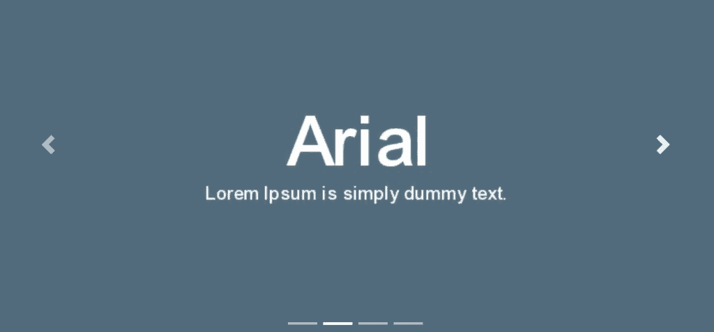
Choose a professional font. Often, the default font in most email platforms is good and professional enough for the most part. Avoid fonts that look like manuscripts, font scripts, and any novelties, like Comic Sans. Arial, which is actually a Gmail font, could be your email font style. But, you should use a font whose letters are clearly different and do not look too much like each other. Fonts like Arial and Helvetica were the first choice a few years ago, while most users did not have high-resolution screens. Arial is still a good choice to this day as it’s pretty much a staple at this point.
2. Verdana
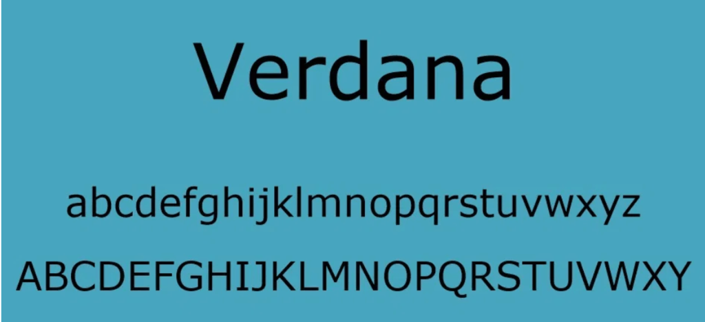
Sans Serif fonts are pure font types, without some great decorations you can find in Arial fonts. Use them to add a modern, sophisticated look to your email. Verdana is a modern and straightforward font from this family. It is a “screen font” and is excellent for viewing on a variety of devices. Verdana could be an ideal type of font for your emails. Using Verdana, computer users can read size 10 or 12 texts effortlessly.
3. Georgia
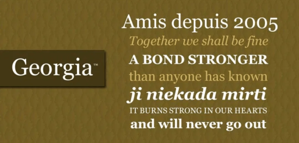
The same goes for Georgia, a typeface with a typographic personality inspired by the need for clarity at low resolutions on the screen. Even at small font sizes, it exudes a sense of friendliness. This typeface combines high legibility with character and charm. Georgia is a font where each letter has its precise shape and ends, which makes it easier and faster to read. The correct spacing between letters and words and a clear letter shape is essential for a good font. Typographers love Georgia.
4. Calibri
Calibri has been used as the default font in Microsoft Office for almost 15 years, so Microsoft believes the change is desirable. Namely, the change should take effect next year, and the company is asking for help from users regarding selecting a new default font. Users will be able to send feedback on five newly introduced sans serif fonts from Microsoft’s announcement – Meet Tenorite, Bierstadt, Skeena, Seaford, and Grandview.
According to the company’s announcement, these fonts contain various styles, including humanistic, geometric, Swiss, and industrial. However, even when a change occurs, users will use the Calibri for a long time because they are used to it, so you do not need to be afraid if Calibri remains one of the five most commonly used fonts for your email. It looks sleek on the screen but is not too readable because it belongs to the Sans Serif typeface family. In other words, this font does not have small horizontal strokes at the top and bottom of the letter, which helps guide the eye around the screen when reading.
However, this is an advantage when writing emails because the one who reads the email does not want decorated letters that will distract him but wants to read the content as quickly as possible. Therefore, you will not do much wrong if you choose to write your email with Calibri. Many users still use it as the default font in their documents, so they are entirely used to it, which certainly gives you an advantage if you also use it as an email font.
5. Helvetica
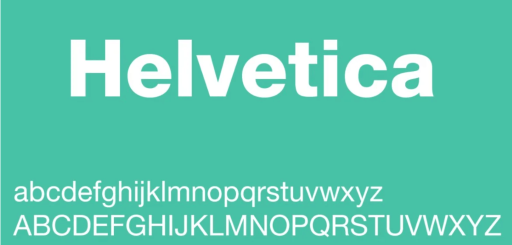
When you are sending an email, it is vital to use a clear and easy-to-read font. With the right choice of font, the recipient will find it easier to read and understand your message instead of focusing on your choice of font size and style. Although the choices are many, Helvetica can be good, but not the best choice for writing an email.
The letters are too compact, and they are just too close. Also, fonts like Sans-serif are not always a good choice for writing email and reading in general because they drain the eyes and create an unnecessary feeling of lethargy. So, first, try the fonts listed above, and if you do not like them, grab Helvetica.
Final Thoughts
Depending on what you create, your font selection will also count. For formal documents, it is vital to use simple, classic fonts. To take your client’s business seriously, it is not a good idea to use art fonts with many decorative elements. A good or lousy font has the power to make your email look professional and modern or outdated and amateurish. It can literally fix or destroy your presentation or the overall impression of your business. If you find yourself struggling with the design or written content of a presentation, you can always write my paper now to ensure it meets the highest standards.
No matter which font you choose, be consistent. Having one paragraph in Arial and another in Verdana is jarring for readers. Similarly, make sure the font size is the same. Regardless of the font size and type, it would help if you made spaces after the welcome introduction, between each paragraph, and before and after signing your email.