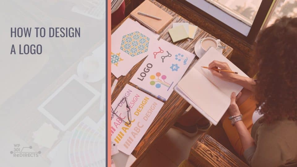
If you are in need of a logo and are planning on creating one yourself, you have a tough job ahead of you. While logo design might seem simple at first, the fact of the matter is that there is more to logo design than meets the eye. If you don’t trust me, go on YouTube and check out a few logo-making videos.
You will be bombarded with information, do’s, don’ts, tips, tricks, etc. When you think about it, creating a logo is no different than creating a piece of fine art. Because of this, it would be foolish of me to try and cover the whole logo-making process as there is too much to take in.
But what I can do is help set you on the right path by sharing four things that you need to consider when creating a logo.
Be open to change
Far too often, we find ourselves gripping a single idea for dear life. While this can turn out great, in most cases, it severely limits our view of things and stifles our creative process. Because of this, I suggest that you get out of your comfort zone and experiment with designs. Take a blank piece of paper and fill it with everything that comes to mind. Think of it as a brainstorming session.
While most of the ideas you write down won’t lead to anywhere, you will still come out of this experience a bit more knowledgeable, and if you are lucky, you might just stumble upon a design that you might have never considered before.
Preparation is key
Depending on the level of skill that you possess and the funds that you have, you are going to have to find the right tool for designing your logo. Thankfully there are a lot of programs and services out there (free and premium) that can help bring your logo to life. We suggest you do some research on your own so that you can better find the right tool for you. But if you need some pointers to check out Squarespace, Canva, or Hatchful, as they are all free tools that do most of the work for you.
Make it serve a purpose
This is arguably the most important piece of information that we are going to share in this article. When designing a logo, you have to understand that the logo is not just a simple icon that you put next to your brands’ name. The logo serves a myriad of functions, but the main one being, acting as the face of your business.
Because of this, you need to design it so that it captures the eye of your audience while also being memorable and easily recognizable. This is, of course, easier said than done. To help you in this regard, we turn your attention to our last piece of advice.
Keep it simple
While having a complex logo might seem like a sign of power at first, it will surely do you more harm than good in the end. When you think about the most popular logos out there, two golden arches tend to stick out. McDonald’s logo is a perfect example of how a good logo should look, simple, and easily recognizable. When you look at it, big firms like Apple, Sony, and their likes all have relatively simple logos. Because of this, we suggest you stick to simple shapes, all while utilizing good color choice and the use of contrast.
In conclusion
Like we said in the intro, there are a million and one things to cover when it comes to logo design, and while you could spend the rest of the year meticulously researching logos and trying to design the perfect logo, we would suggest otherwise. Keep the previously mentioned pointers in mind, and go create a logo for yourself once you make something that you are relatively happy with using it.
Even if it isn’t the best, it’s not like your logo is set in stone; you are free to change it as you see fit. Because of this, there is no reason to keep obsessing over your logo, because in the end, the logo is just a tool, something that will help you stand out among the crowd, but even if you do stand out, but your business or blog is bad, then no well-designed logo will help you.
